As Creative Director and lead designer for the launch of CassiusLife.com, I helped build the brand from the ground up—partnering with a newly formed editorial team to develop a bold, modern identity that positioned the site as a leading voice in culture, style, and progressive thought for Black men. The vision was clear: create a platform that felt unapologetically fresh, intelligent, and culturally locked in from day one.
Challenge: Cassius had no existing brand infrastructure—no visual identity, editorial precedent, or digital presence. We had to define everything: the tone, the look, the experience. The challenge was to craft a design system that spoke to a wide range of Black voices and perspectives, while launching a premium media product that could stand confidently alongside legacy publishers.
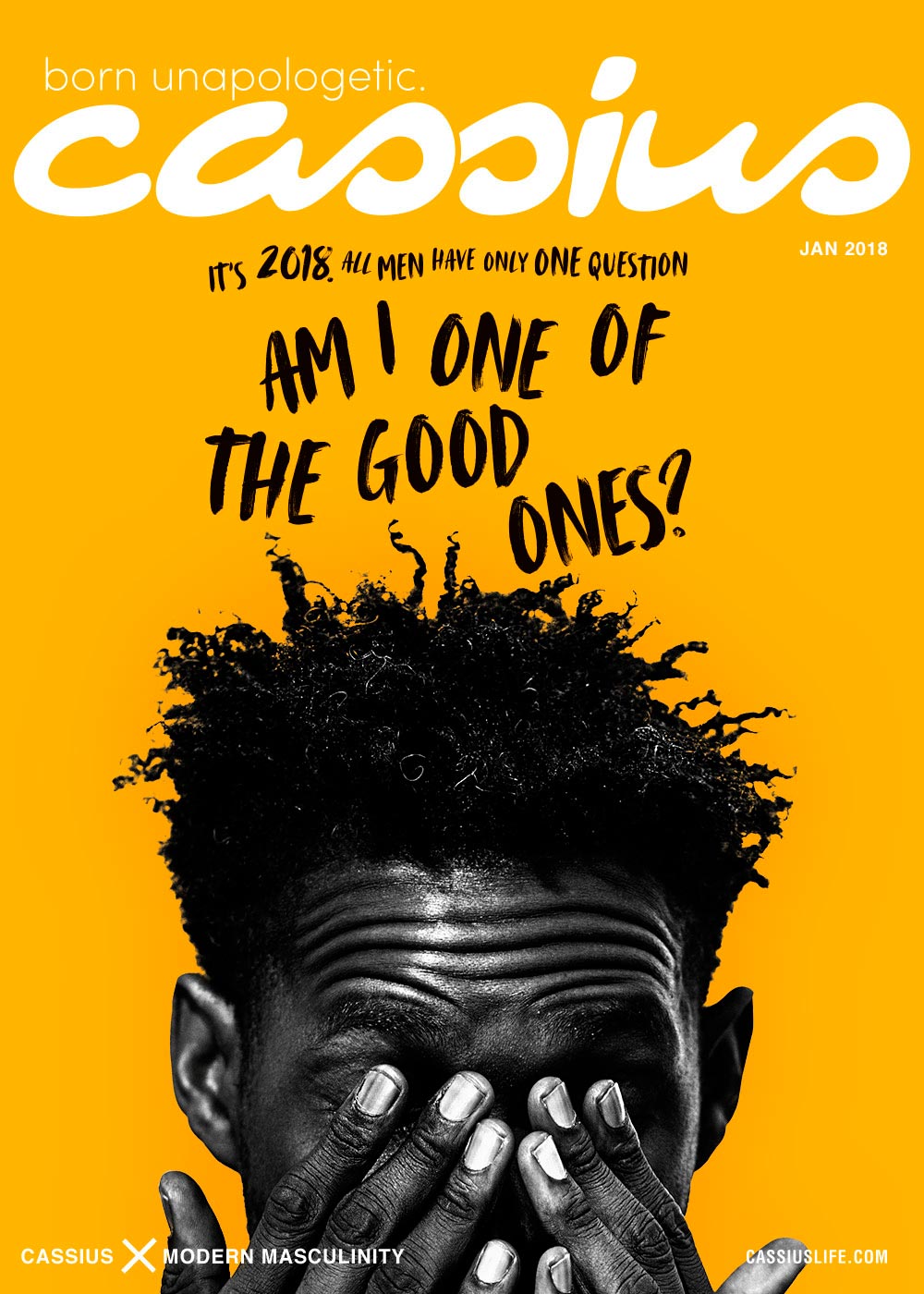
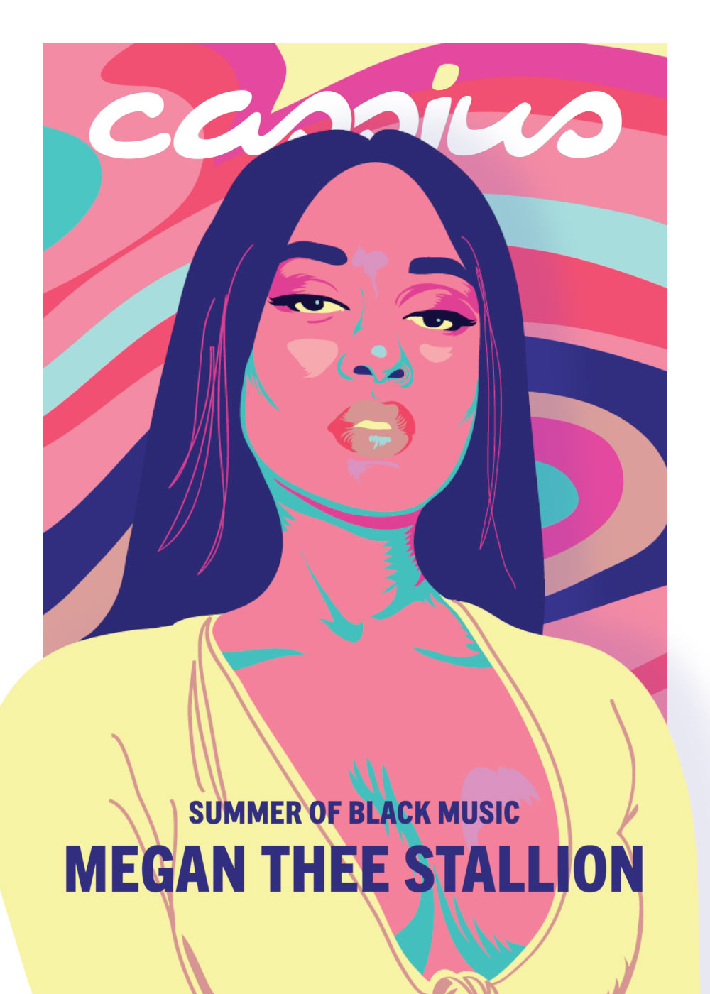
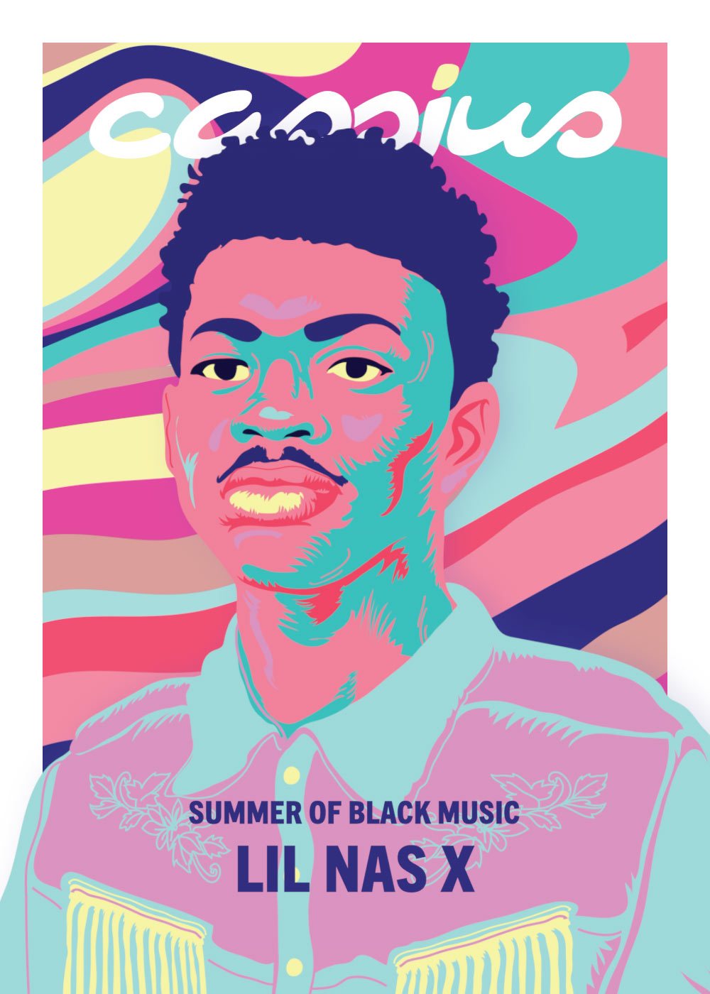
Solution: I led the creation of the site’s visual identity and UX from scratch—defining its typographic voice, visual hierarchy, and motion language. I launched Cassius’s signature monthly digital covers and built the creative and operational workflows to support them—ensuring they landed with consistent impact and high production value. In parallel, I helped grow and shape the design and creative services team that would continue to support brand, editorial, and sales initiatives post-launch. The result was a cohesive, culture-driven platform that looked as sharp as its perspective—and delivered day in, day out.
Role: Creative Director, Design Lead Team: iOne Digital In-House Creative Illustration: Mariano Henestrosa
LogoSystems
The logo for CassiusLife.com was crafted to embody strength, individuality, and modernity. With sleek, clean lines and a minimalist approach, the logo is both versatile and impactful. Its bold design, featuring sharp geometric shapes, symbolizes the brand’s focus on forward-thinking culture and style. The monochromatic color scheme ensures adaptability across various digital and print platforms, while the subtle use of gold accents reinforces a premium, sophisticated look. This balance between simplicity and boldness allows the logo to stand out and be instantly recognizable.
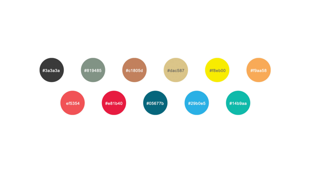
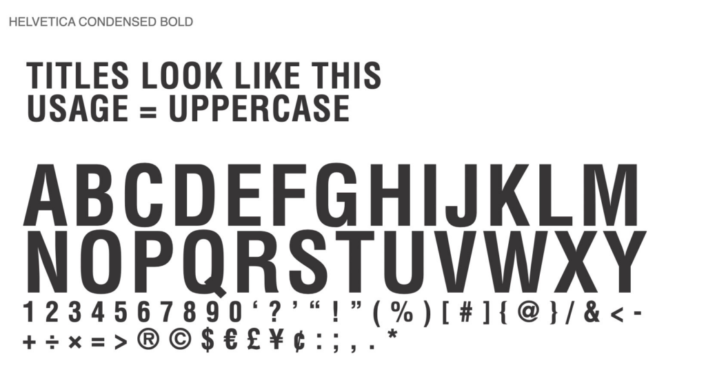
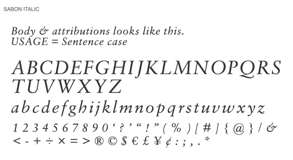
Color Palette & Typography
CassiusLife.com’s color palette was designed to reflect both power and vibrance, using bold greens and reds in addition to muted neutrals. These tones convey a sense of culture while also mischievous and gen Y. The typography features bold, sans-serif fonts for headings, providing a strong, assertive presence, while lighter, more refined fonts for body text ensure readability and elegance. The contrast between these elements creates a dynamic visual hierarchy, guiding users through the content with ease.
UXDesign
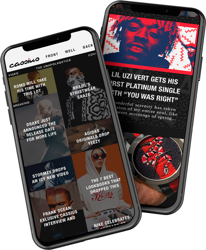
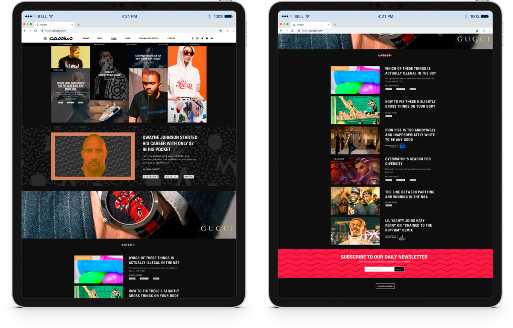
The user experience (UX) design for CassiusLife.com was focused on delivering seamless interaction and intuitive navigation. The mobile-first approach ensured that users could engage with the brand on any device. The layout was strategically designed to prioritize content discovery, with a clean, uncluttered interface that makes it easy for users to explore articles, videos, and features. Key UX enhancements included personalized content recommendations, interactive elements, and smooth transitions that keep the user engaged without overwhelming them. The overall goal was to create an enjoyable and efficient browsing experience that aligns with the brand’s sleek, modern aesthetic.
Visual Identity Consistency
The visual identity for CassiusLife.com merges style, culture, and individuality. The brand’s aesthetic is built around a balance of boldness and sophistication, using a combination of dynamic typography, rich visuals, and clean layouts. This cohesive visual language was developed to resonate with the site’s core audience—progressive, style-conscious individuals. Custom graphics, icons, and imagery were incorporated to create a distinct brand personality, while the consistent use of the logo, color palette, and typography across all platforms ensured a strong, unified brand presence.
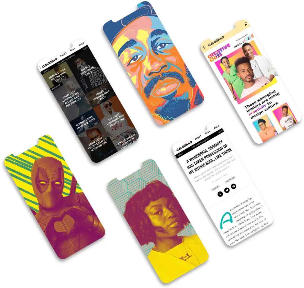
Social, Motion, Editorial, & SalesDesign
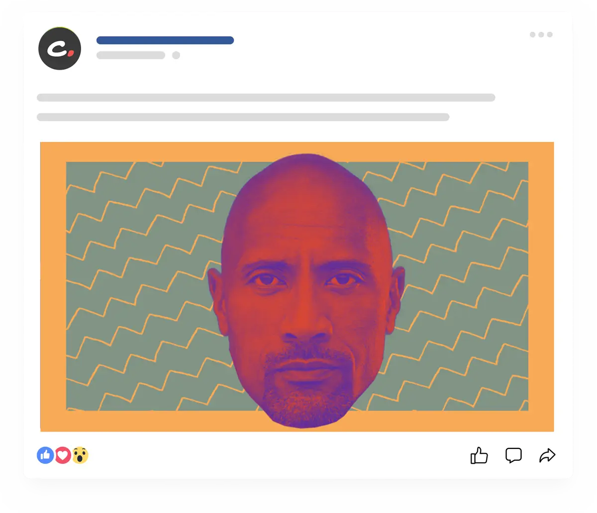
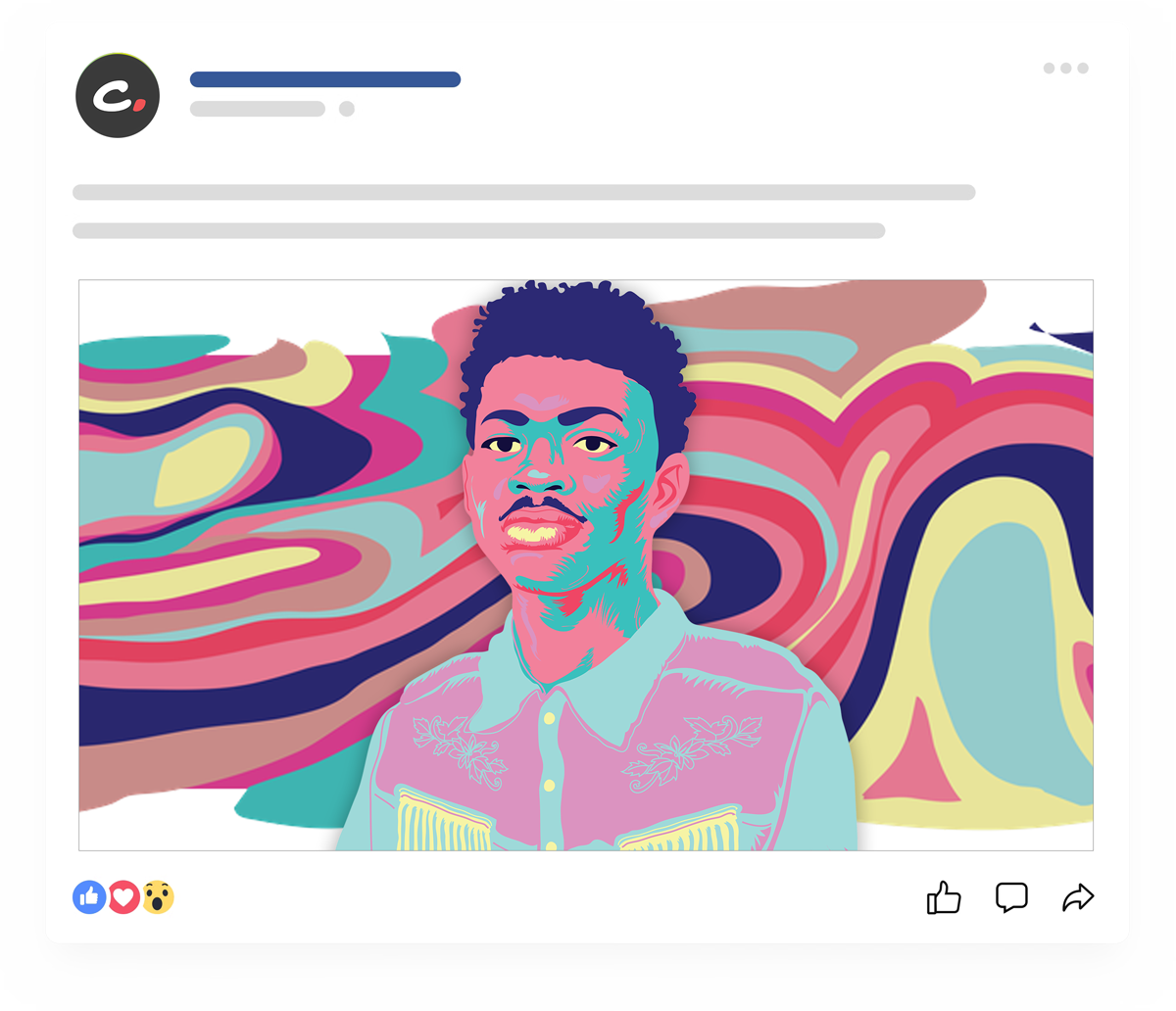
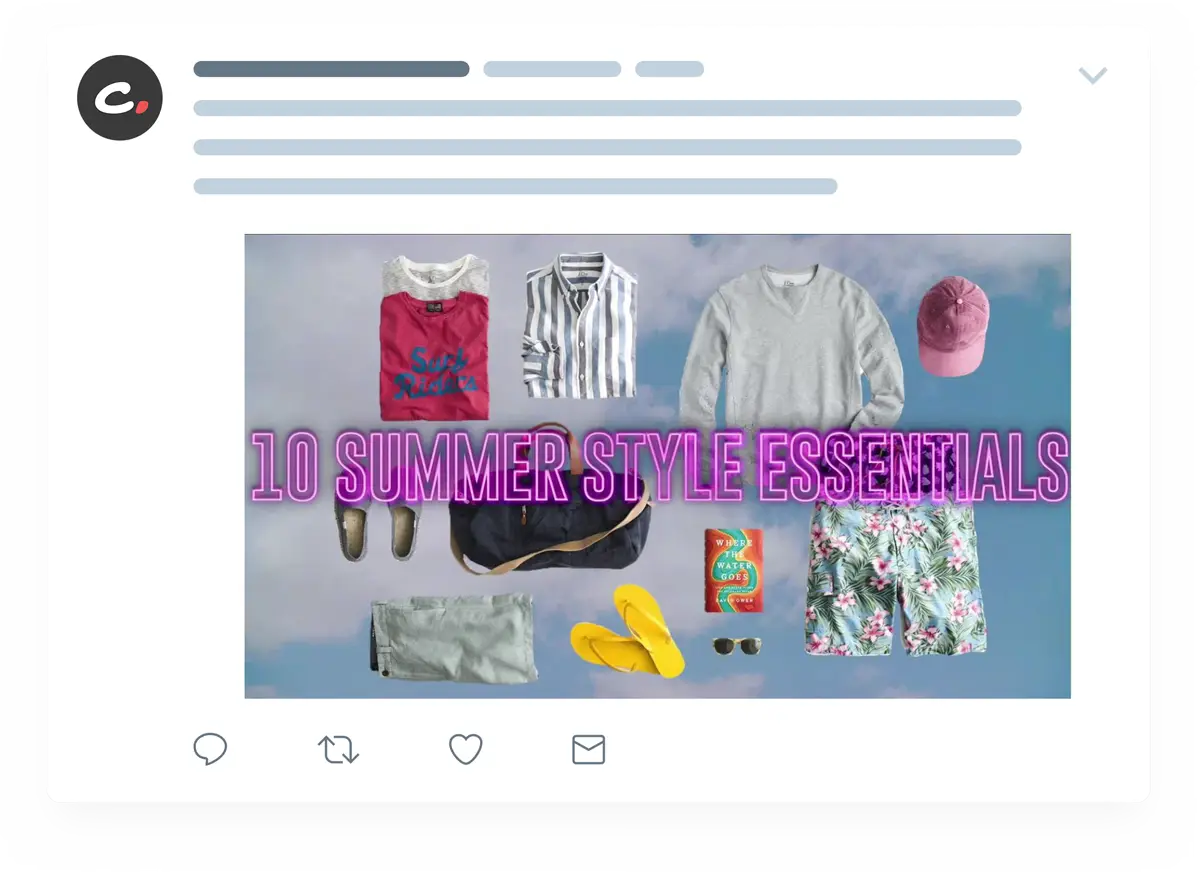
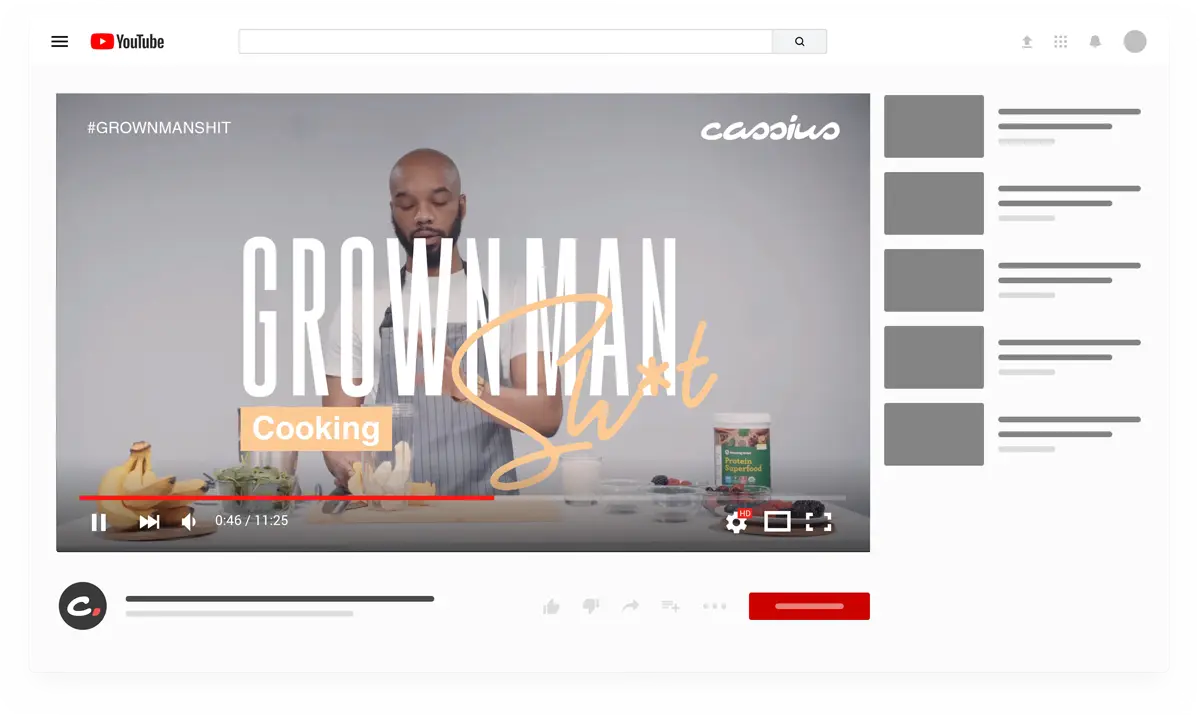
The visual design extended beyond the website to cover CassiusLife.com’s social media, motion graphics, editorial layouts, and sales collateral. For social platforms, striking visuals with bold text overlays were created to increase engagement and ensure brand consistency across channels. Motion graphics, including animated logo reveals and transitions, infused energy into digital content, making it more dynamic and appealing. The editorial design was streamlined, using clean typography and rich visuals to enhance storytelling. Sales collateral, including pitch decks and promotional materials, followed the same strong visual identity, utilizing branded elements and polished infographics to communicate the value of the brand to advertisers and partners.
Privacy Settings
We use cookies to enhance your experience while using our website. If you are using our Services via a browser you can restrict, block or remove cookies through your web browser settings. We also use content and scripts from third parties that may use tracking technologies. You can selectively provide your consent below to allow such third party embeds. For complete information about the cookies we use, data we collect and how we process them, please check our Privacy Policy